
On Repeat: new Lindisfarne Castle monotype paintings
- Nov 5, 2025
- 4 min read

I'm delighted to share a new series of Lindisfarne Castle monotypes, exploring a single composition multiple times. In the past, I usually created just one image for each compositional idea. Now, I want to go deeper, using the unique qualities of the medium to give myself multiple opportunities to depict the subject with subtly different colours and approaches, suggesting varying light and weather conditions.

I'm not alone in wanting to rework the same subject repeatedly. It's a common approach among artists—and in other fields—where multiple iterations of a project bring you closer to mastery and genuine progress. Monet famously revisited the same subjects under different light conditions. As a teenager, I saw a large number of his Rouen Cathedral paintings at the Royal Academy, each with different light and colour. Monet believed a subject is constantly changing because light, season, weather, and atmosphere are never the same twice. He famously said:
“For me, a landscape does not exist in its own right. Its appearance changes at every moment.”

For my subject—the iconic Lindisfarne Castle on Holy Island at dawn—the light can shift minute by minute, influenced by the rising sun, clouds, wind, and atmospheric moisture. Unlike Monet, I’m not sitting in front of the subject trying to capture fleeting moments. Instead, I connect the idea of changing conditions to the monotype process I’ve developed, which is perfect for printing translucent veils of colour.
If you’re unfamiliar with monotype, you can see my process on my YouTube channel. It’s a low-tech method of printing from a smooth plastic surface onto paper using a printing press. It’s also called monoprinting when you use repeated elements. I use paper stencils to print the castle, but I cut or tear a new one each time, as the stencil is usually destroyed after one use!
What I love about monotype is the swift mark-making and the possibilities for overprinting, which allow for truly luminous effects that echo the properties of light and atmosphere.

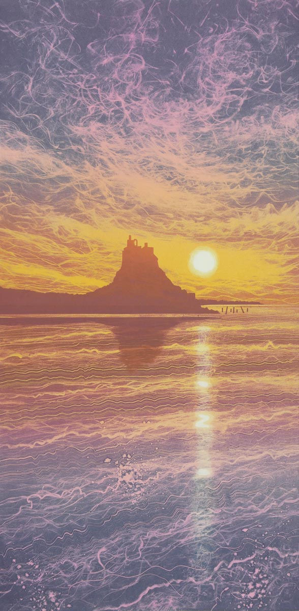
In my first four prints (above and immediately below), I used a rich palette of blue and magenta for the key shapes and mark-making in the sky and sea. Where the two colours blend, they create deep purples. Once dry, I overprinted with transparent roll-ups of graded colour, shifting from gold to pink. Still Waters has a still reflection in the sea, while Light Lines, below shows movement in the water and a long bar of reflected sunlight.
Two of these prints (below) “went wrong” due to technical mistakes, as it had been a while since I worked this way. In one, I omitted the space between the castle and its reflection, leaving just a single shape. In the other, I accidentally printed the castle in the water area instead of the sky—a moment’s lapse in concentration!

For the next three, I tried a slightly different approach: overprinting in translucent colour, where the printing ink contained a little white to suggest diffuse light and early morning mist. It’s like looking through cloudy apple juice rather than clear. The reflected sunlight is more fragmented, which I think looks more natural as it glances off the waves. I experimented both with and without a reflection of the castle, and I personally prefer the reflection—let me know your thoughts in the comments.


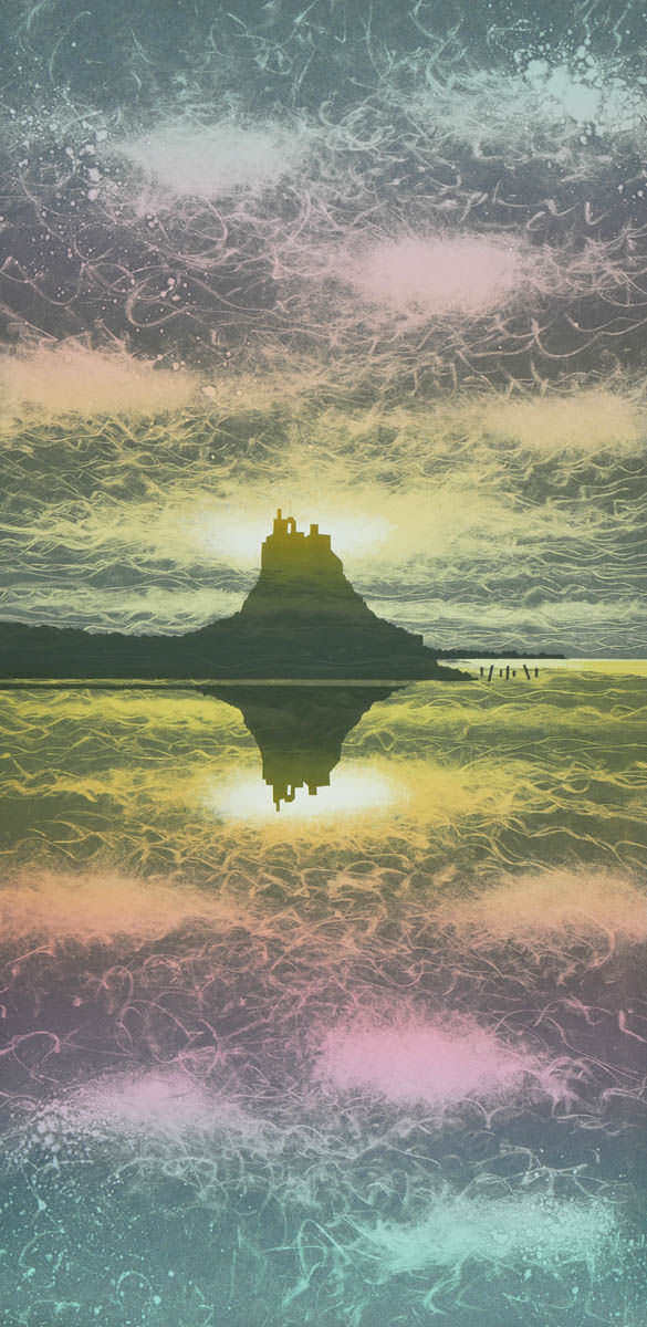
The final two prints were created in black ink, with translucent colour layered over to soften the clouds and add colour to the sky. I also added a transparent layer of colour over the sea to make it slightly darker than the sky, creating a clear distinction between them.


I feel I could go on endlessly with this single composition, experimenting with myriad colours and layers to express different moods. For now, I’ve paused and moved on to a new project, which I’ll share next time. So, which is my favourite? Each evokes a different mood, but if pressed, I’d choose Glancing Light for its soft, atmospheric light and gentle movement in the water.

I’d love to hear which is your favourite—let me know in the comments! These Lindisfarne Castle monotype paintings are now available for sale. Contact me at +44 7717 256169 or email info@rebecca-vincent.co.uk if you’d like to purchase or discuss framing and delivery options. You can also view them in my studio if you’re in the area on a Wednesday or Friday.
Subscribe to my email list to be among the first to see new work and gain insights into my process.
If you enjoyed these new originals, you might also like this limited edition print of the iconic Northumberland castle:


Comments